Kookedo
A modular identity for an indie kids retail store — built from shapes a kid could draw. Circles, half-moons, triangles. The same kit becomes a logo, a tote, a sign, a million different things.
A kids brand that doesn't talk down to kids.
Kookedo was an independent retail store for kids 0–12 — competing with brands that mostly default to cartoon mascots, bubble fonts, and the same five childcare clichés. The brief was sharper: a brand that's playful without being patronizing, that a kid would want to wear and a parent would put on the shelf with intention.
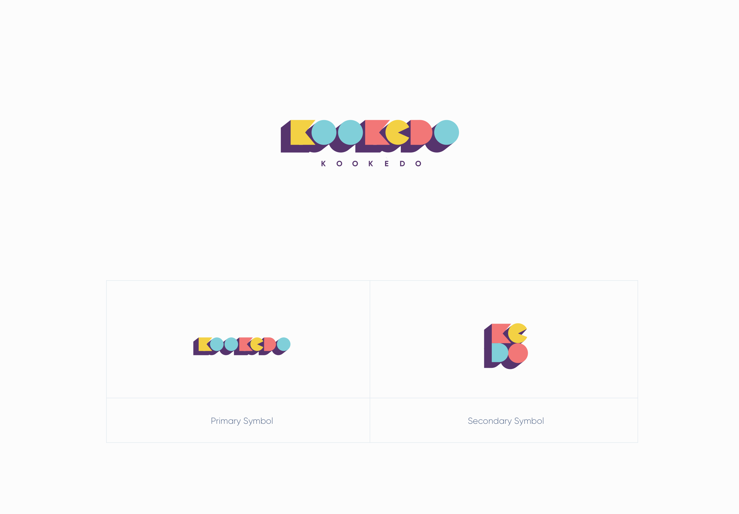
A logo made of basic shapes.
The wordmark is built from a half-circle, a full circle, a triangle, and a stub — geometry simple enough that a 5-year-old could redraw it on paper. That simplicity is the system: the same shapes that make the logo make everything else.
Four colors that read at any size.
A purple anchor with three primaries — yellow, coral, mint — bright enough to compete on a shelf, calm enough to live in a kid's bedroom. Used in equal weight; no accent, no secondary.
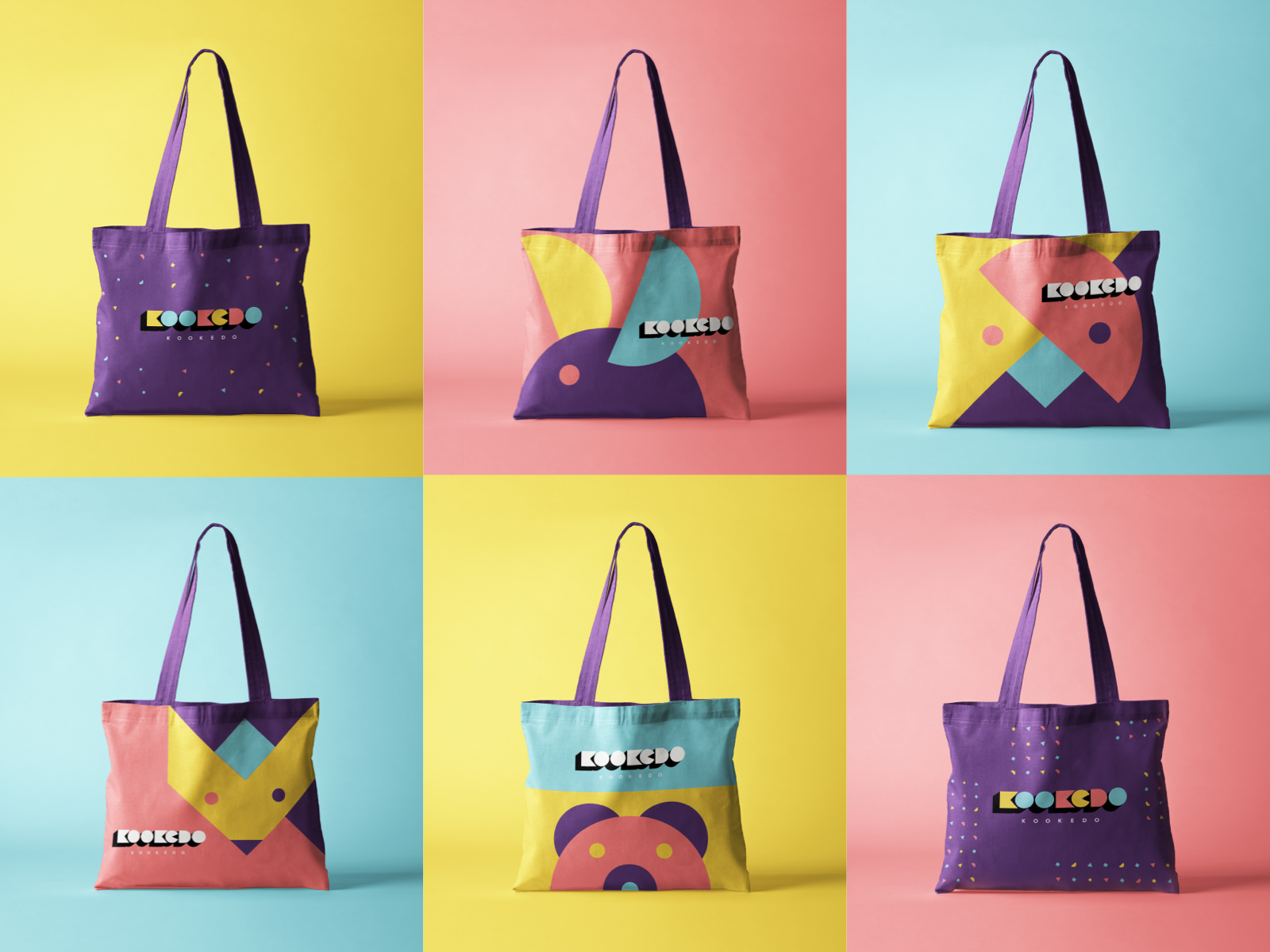
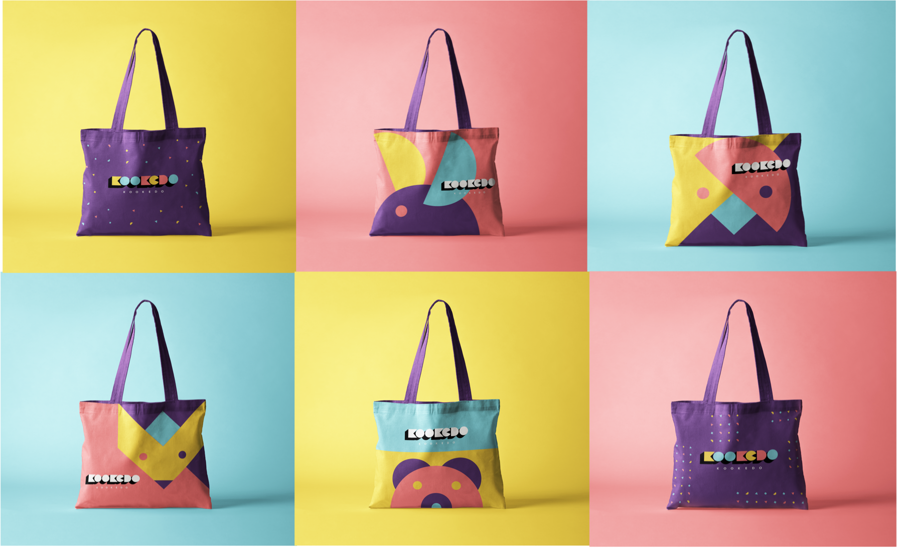
Same shapes, six totes, infinite combinations.
The shape kit means every tote, sticker, and shelf-tag can be its own composition without ever leaving the system. Below — six totes from one alphabet of forms.
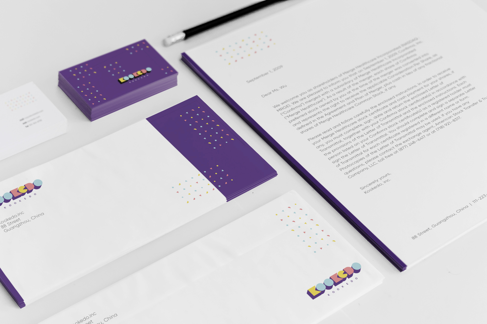
A corporate identity that still feels like a toy box.
Letterhead, business cards, envelopes — the pattern at small scale, restrained palette, the system reading equally well in a kid's hand or a wholesale buyer's email.
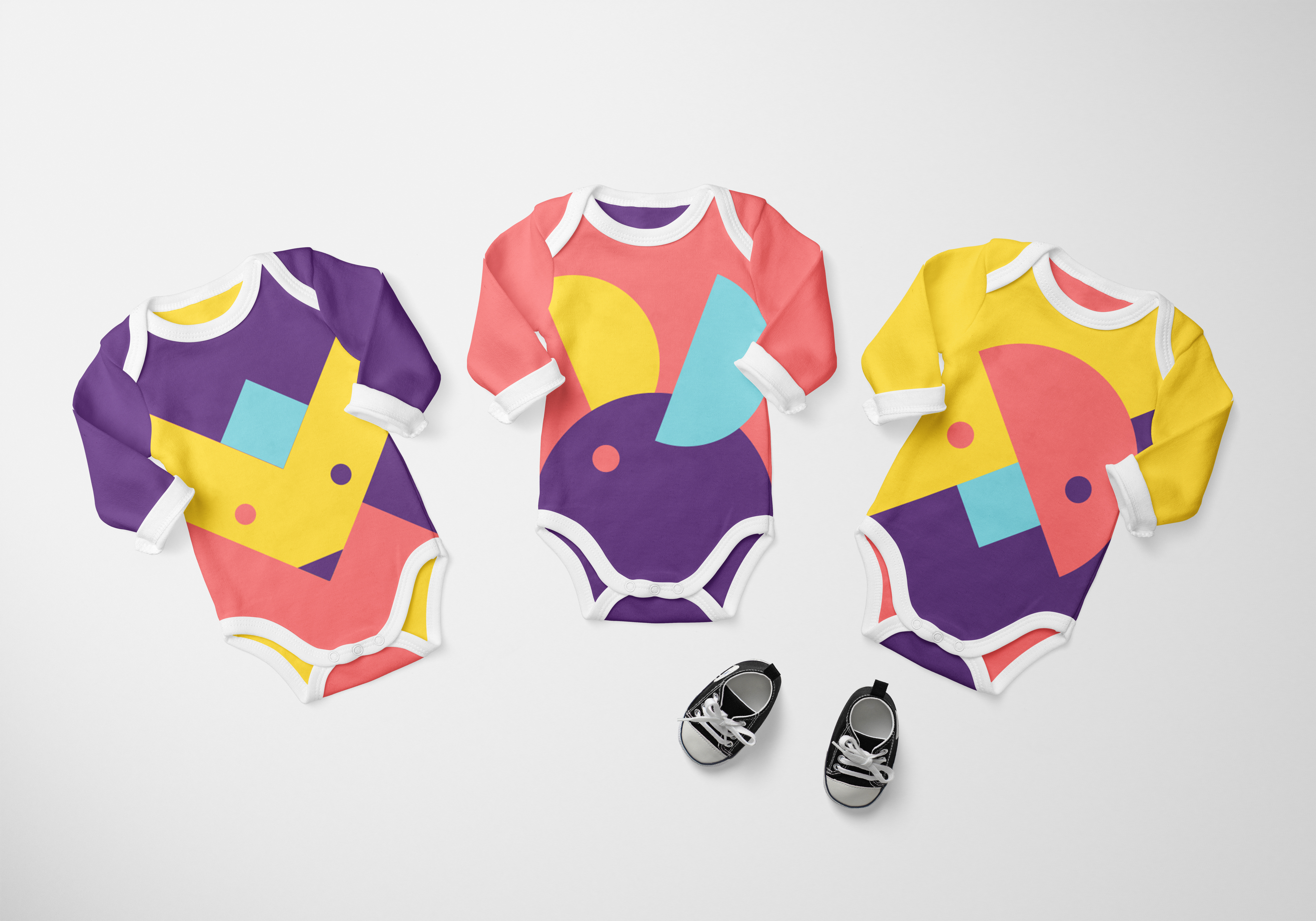
The shape kit, worn.
The same modular forms scaled up into wearable graphics on baby onesies — no characters, no licensed IP, no cliché. Just clean shape compositions a kid actually wants to wear.
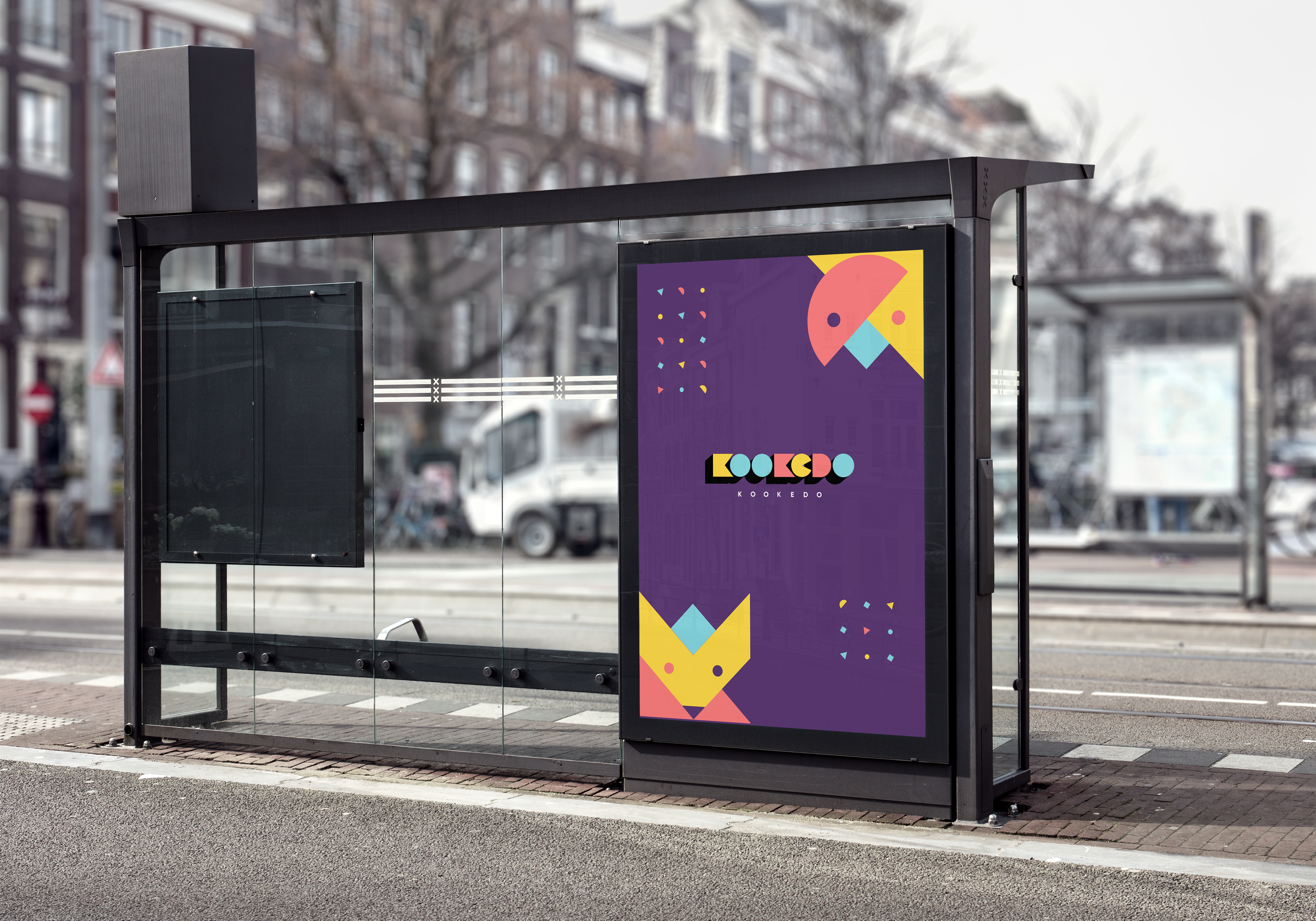
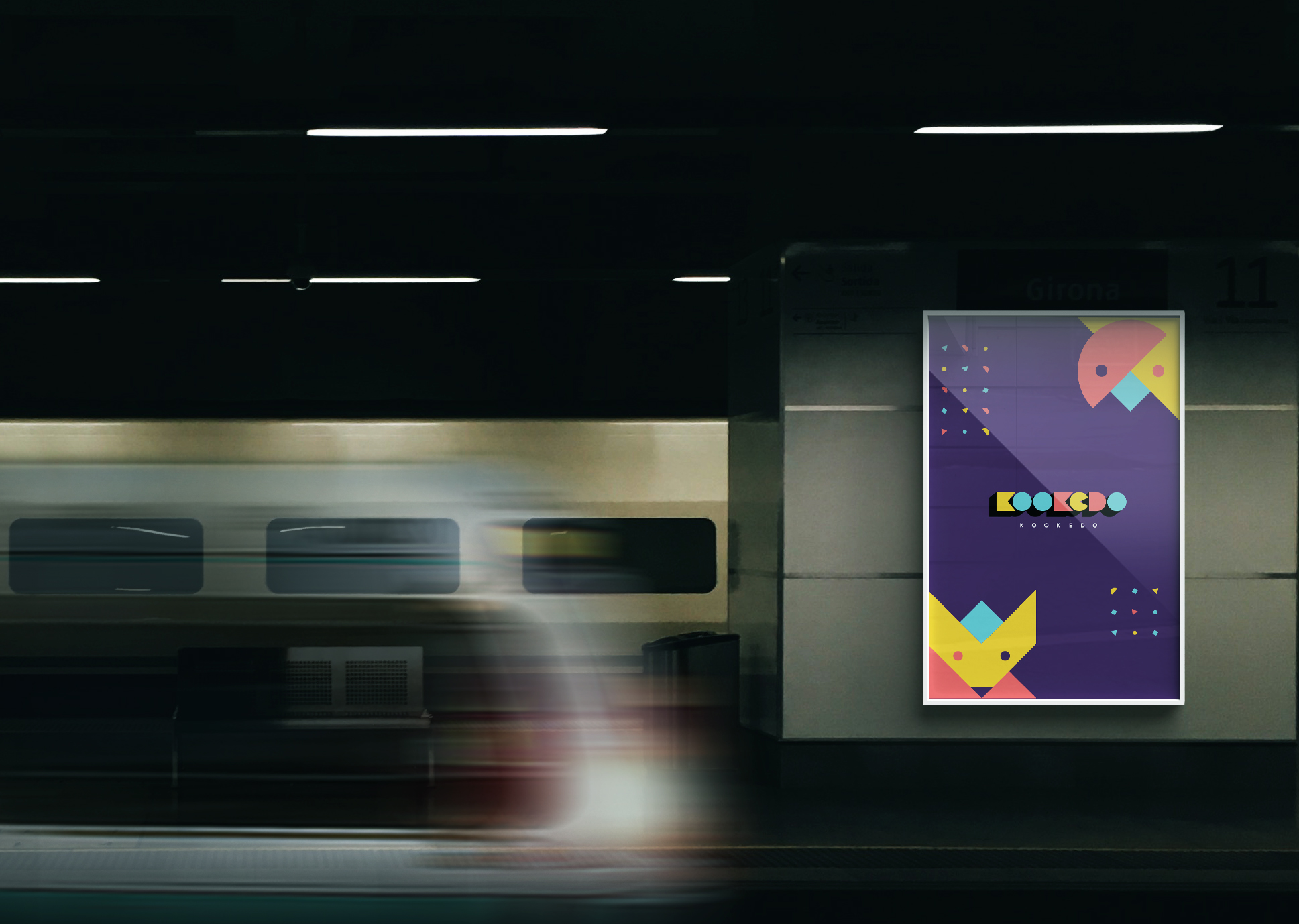
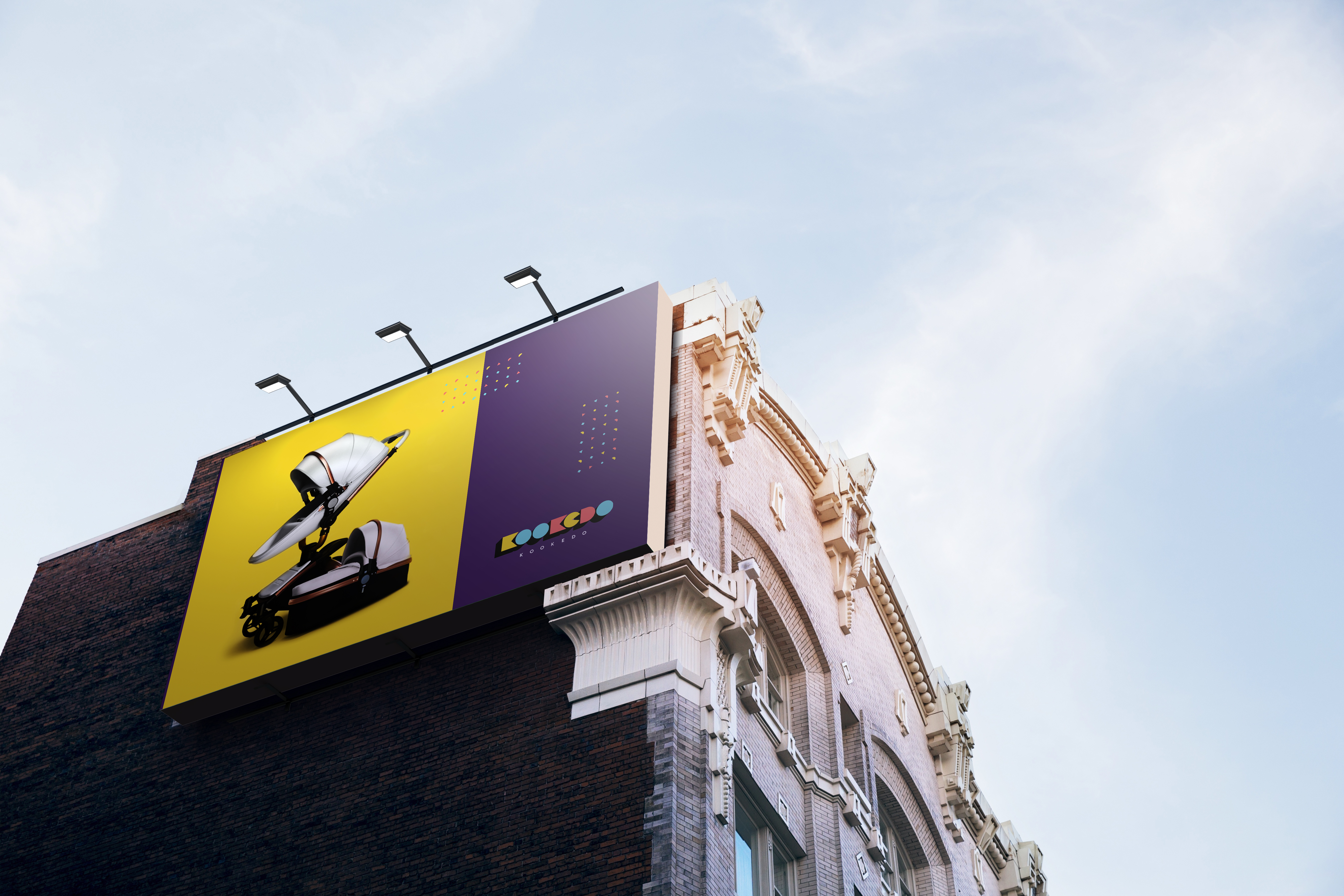
A brand that holds up at billboard scale.
The compositions scale from a business card to a side of a building without losing structure. Three placements: bus stop, subway platform, and a four-storey city wall.
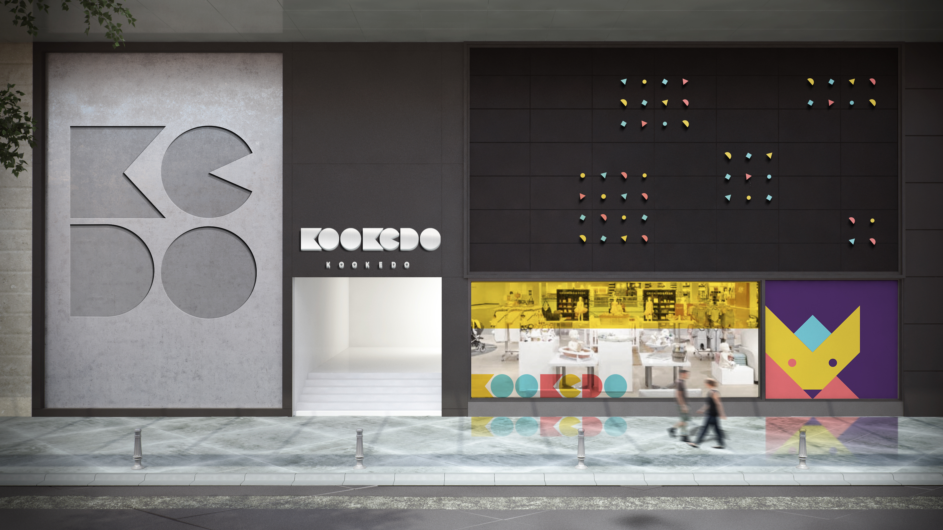
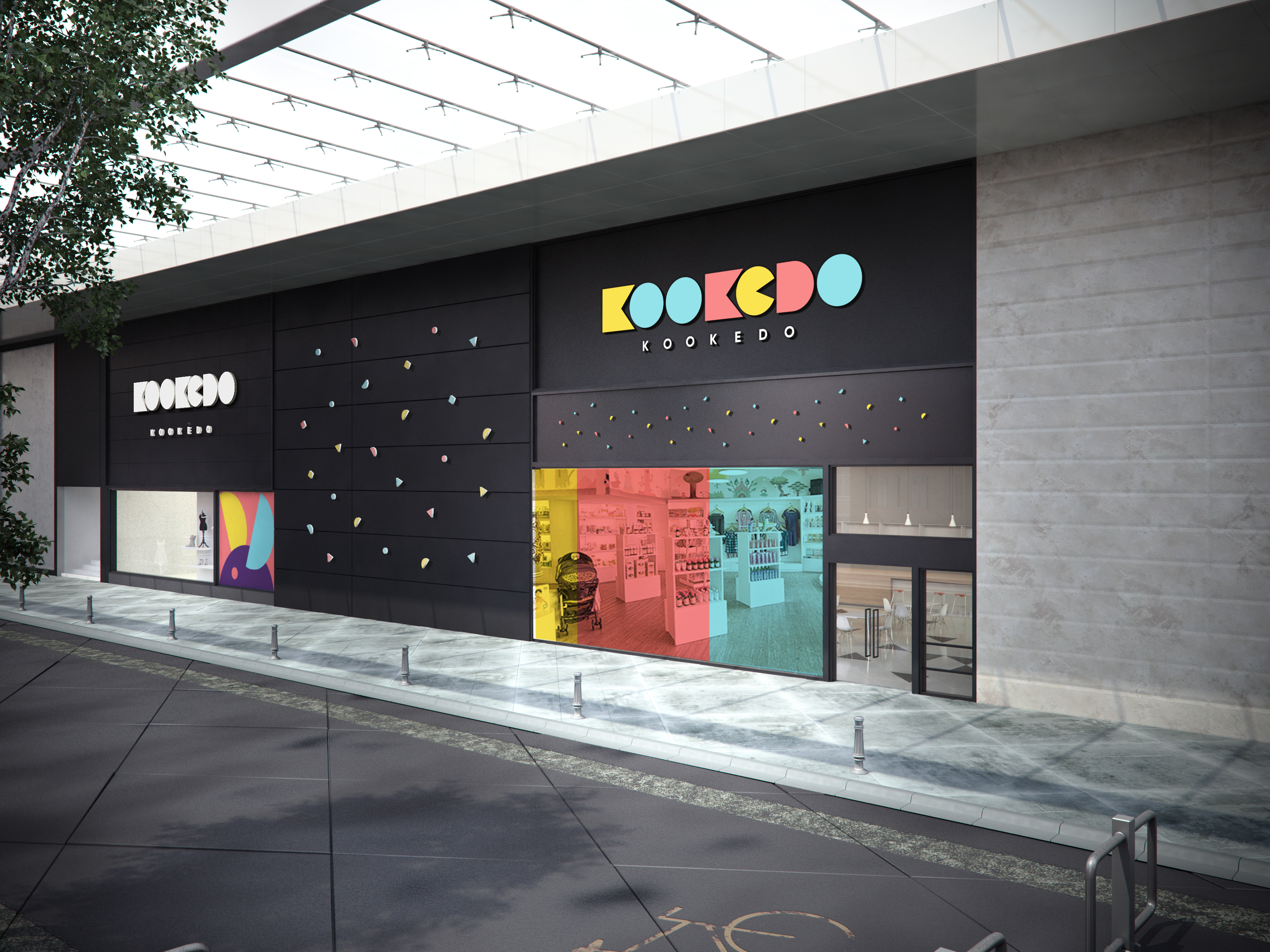
The brand as a place to walk into.
Two storefront concepts — one sculptural (the letters carved into concrete), one playful (the wordmark in primary colors on a black wall). Same identity, two completely different environmental moods.
The shape kit was the brand — simple enough for a kid to remix, structured enough to stay a system. The work I'm proudest of usually starts with that kind of constraint.