Rip van Wafels
A small Dutch wafel brand walking into the $7B US cookie aisle and asking to be taken seriously. The work: a brand that felt European but read American, packaging that earned its shelf, and a site that turned a snack into a story.
Make a wafel that earns its place on the shelf.
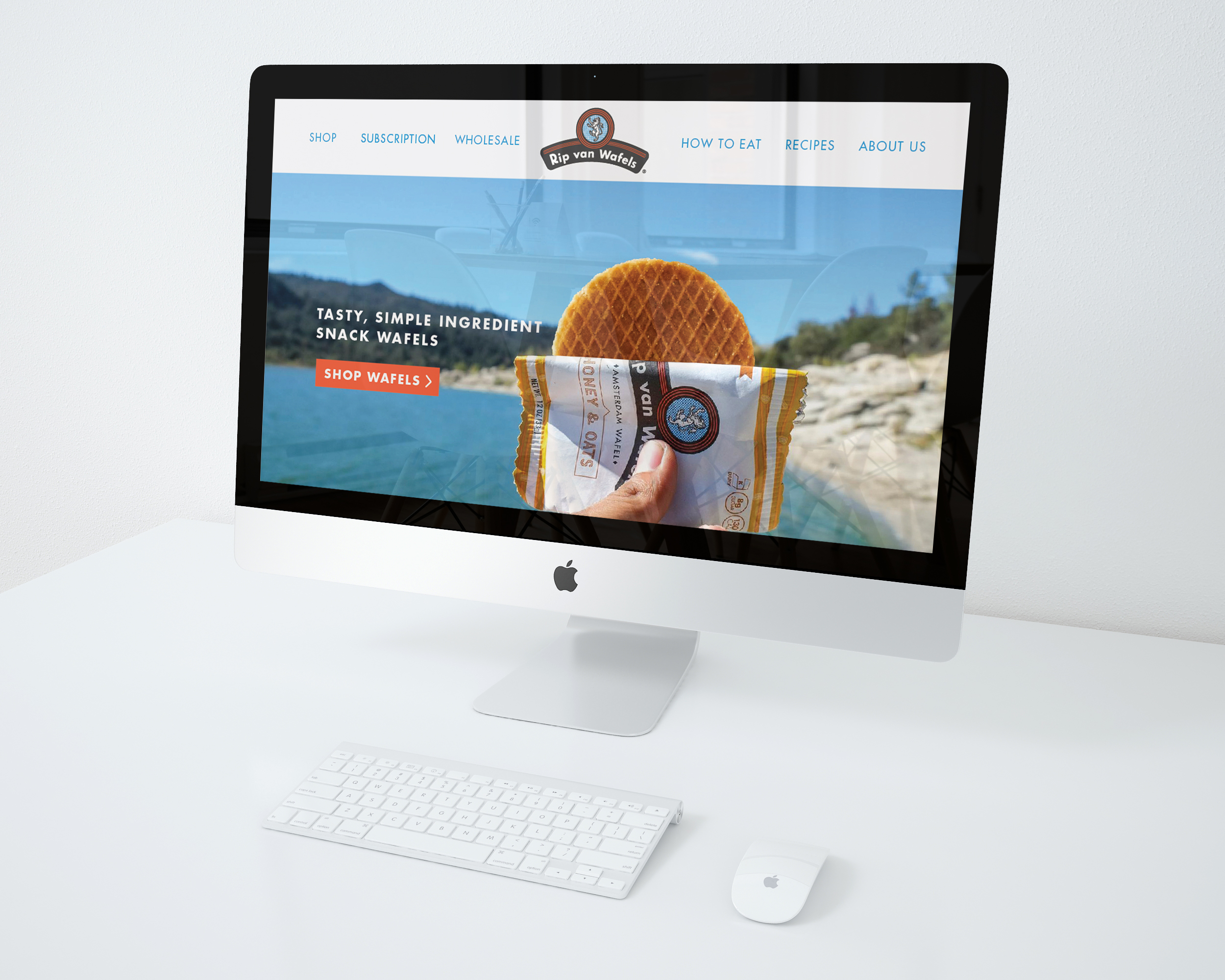
The American cookie aisle is loud — bright bags, cartoon characters, sugar-first packaging. Rip van Wafels wanted in, but its product had a different story: cleaner ingredients, lower sugar, Amsterdam roots. The brand needed to read as more grown-up than its neighbors without losing the small joy a snack is supposed to deliver.
A heraldic badge with a wink.
Old-world badge, modern type
The badge nods to old European product marks — the kind you find on imported tin boxes — but the typography sits friendlier and rounder. A bear-shield in the center keeps the wink intact; the wordmark stays confident enough to hold a shelf.
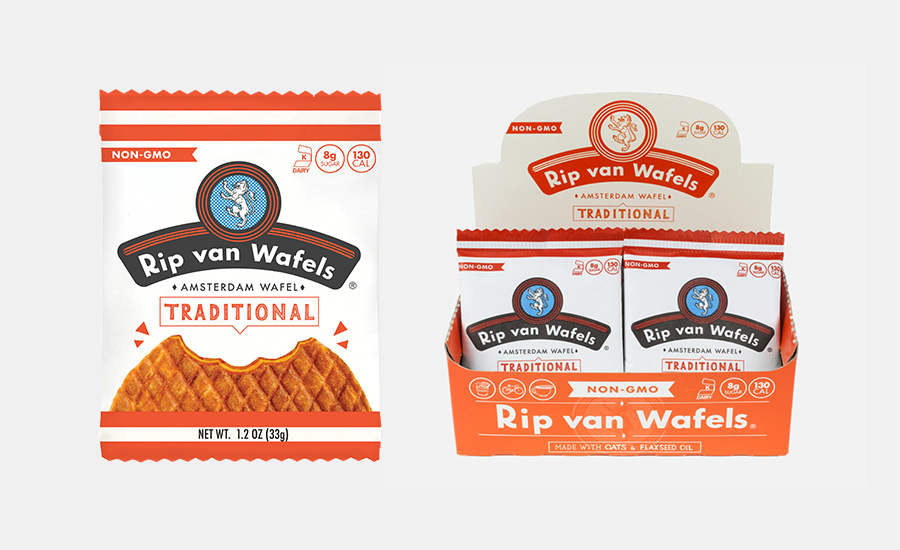
Coral, cream, and the wafel itself.
Reads at speed, holds the brand close
A coral-and-cream system that reads from across the checkout line. Each flavor gets its own punctuation — "Traditional," "Honey & Oats" — but the badge, the die-cut top, and the side-bar are constants so the family stays a family.
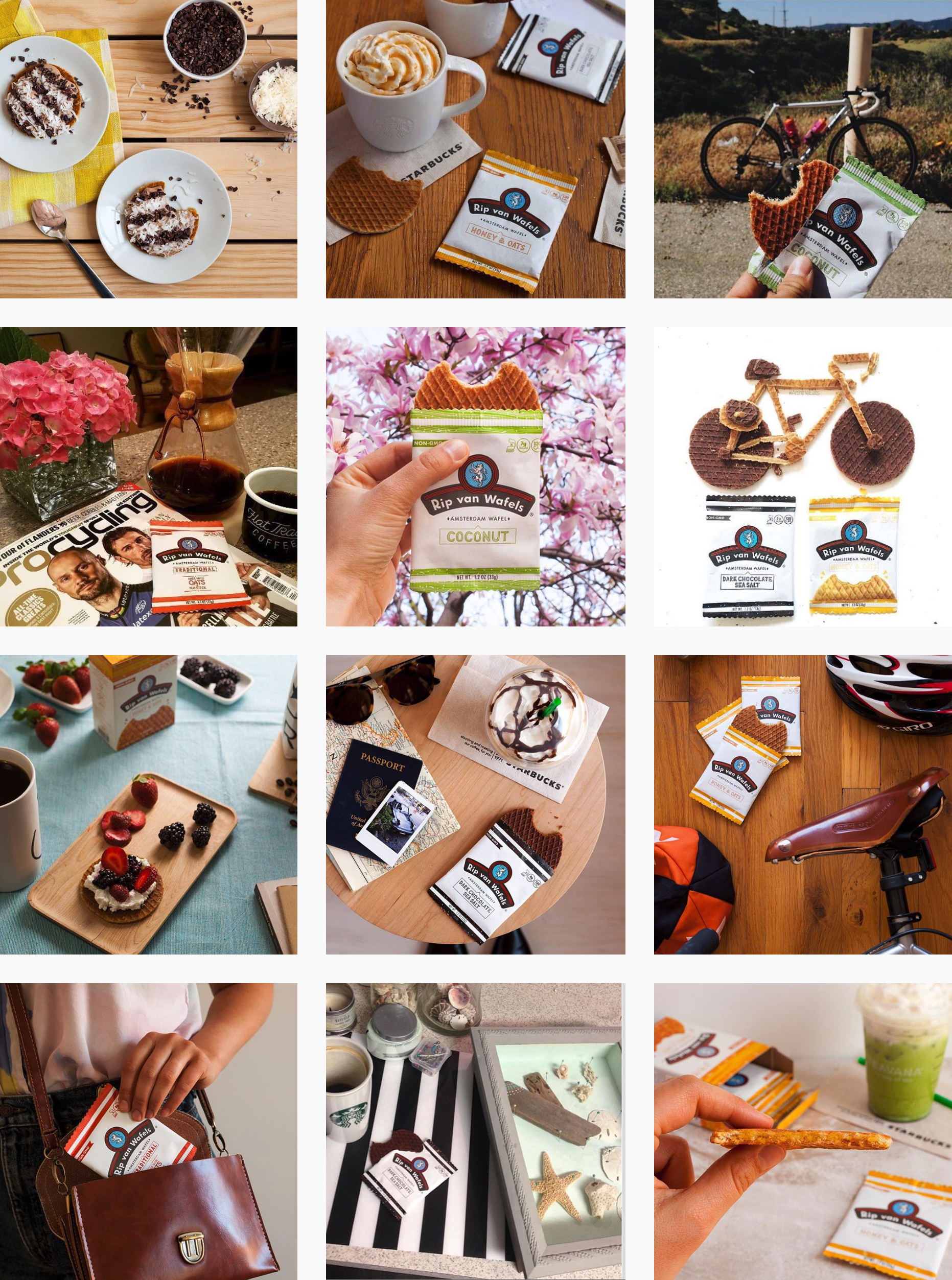
The brand in the wild.
The Instagram grid as a brand surface. Lifestyle photography across travel, mornings, bikes, coffee — wafel as a small companion to a better-feeling day.
A small wafel from Amsterdam, dressed for the American shelf. Still one of the calmer pieces in the aisle.