UserTesting
Brand Refresh
A new identity for the human insight company. I contributed to the broader brand system as part of the in-house visual team, and owned the icon library + web motion proposal + advertising applications.
Make a research company look as human as the word in its name.
UserTesting was building a category around human insight — but the old brand still read as enterprise software. The refresh had to keep the trust signal a category leader needs, while adding warmth, type with personality, and a system that scaled across product, marketing, environment, and merch.
The work was a team effort led by Amy Li, with Yunji Jun on visual and Nick Slater on illustration. I contributed across the system, and owned a handful of pieces end-to-end.
What I owned and shaped in the team's system.
Naming what's mine in a team brand project matters — both for the team's credit and for the reader's clarity. Some of this I drove end to end; some I helped shape alongside the team.
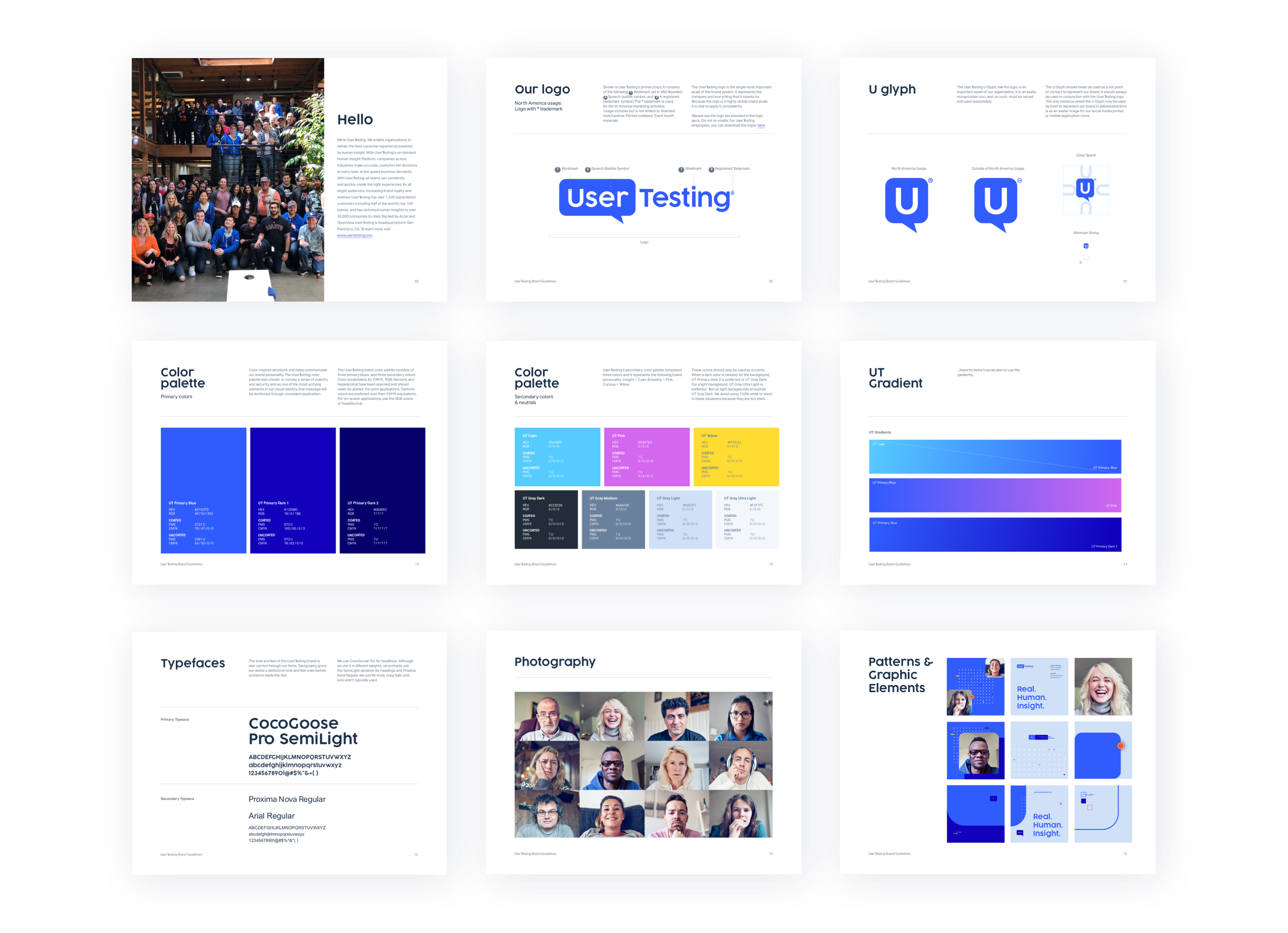
Led the system from scratch — drawing rules, weight, optical sizing, naming. Shipped across marketing, environmental, and product touchpoints.
Helped define the core idea behind the refresh — how to bring the human side of UserTesting forward — which anchored the new visual direction.
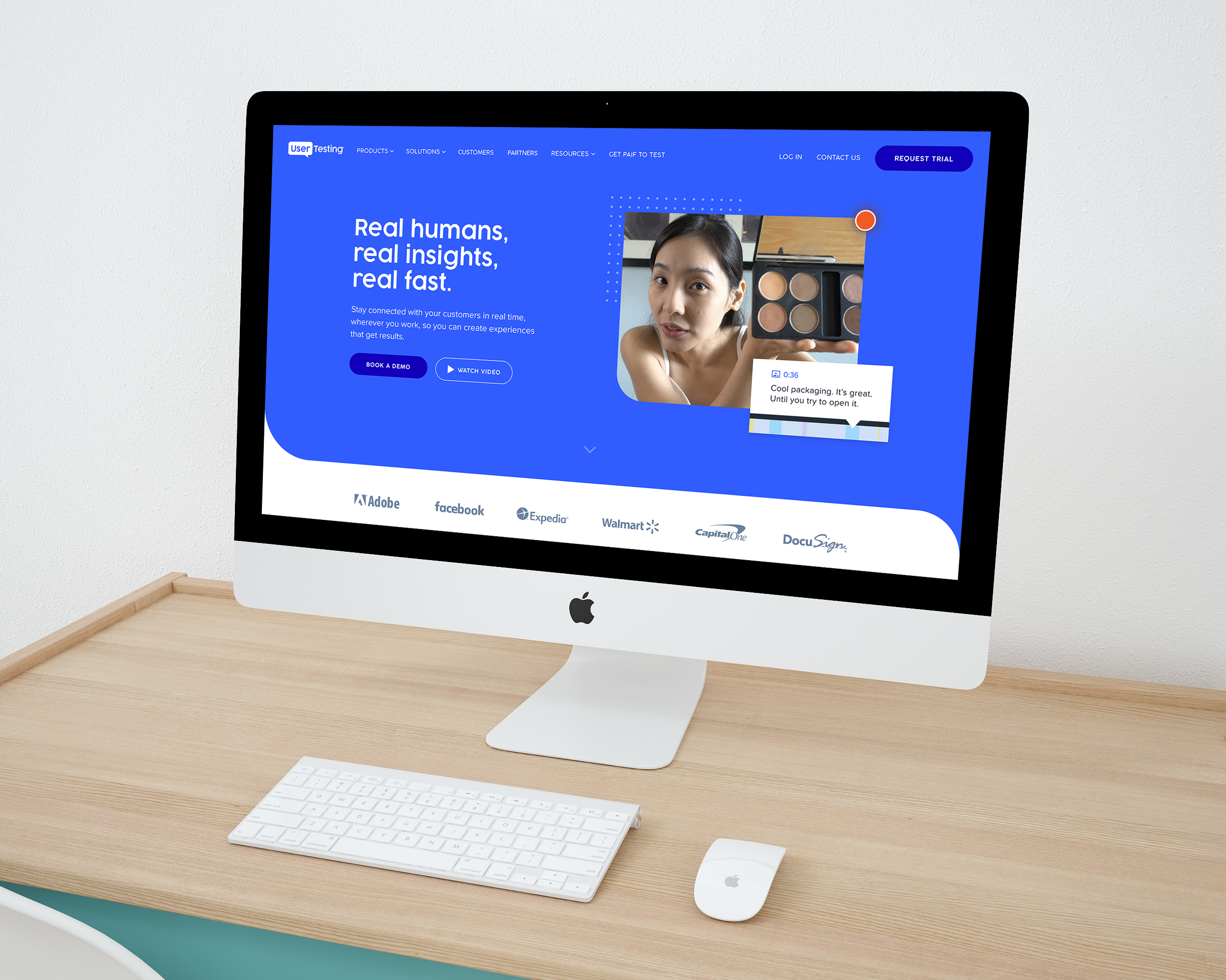
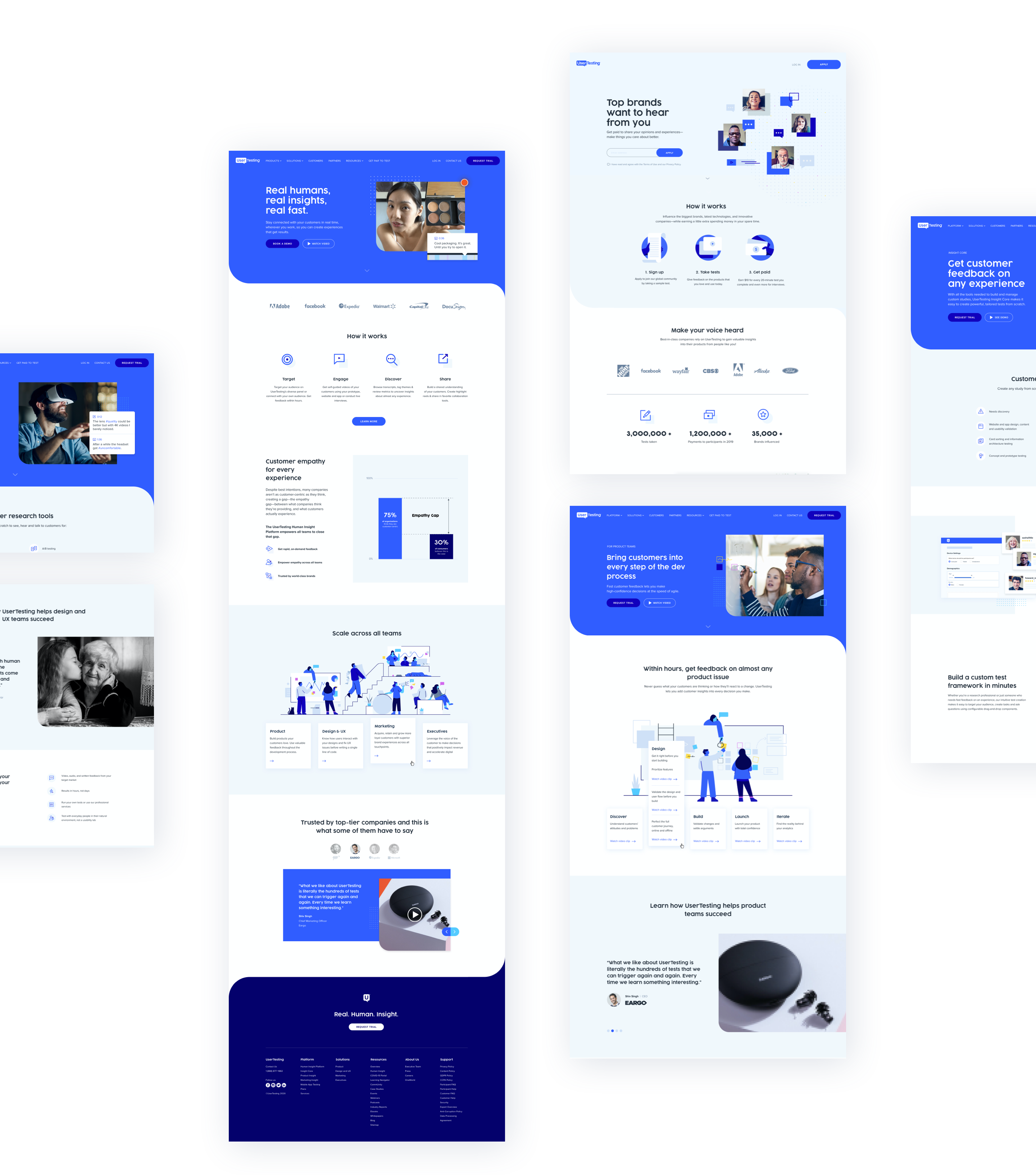
Designed pages for the refreshed site, translating the new identity into responsive layouts and reusable components.
Explored color directions and the supporting pattern system that gave the identity texture and flexibility across surfaces.
Adapted the refreshed identity into paid social across the many unit sizes media needs, with templates the marketing team could extend without me.
A small tour of where it landed.
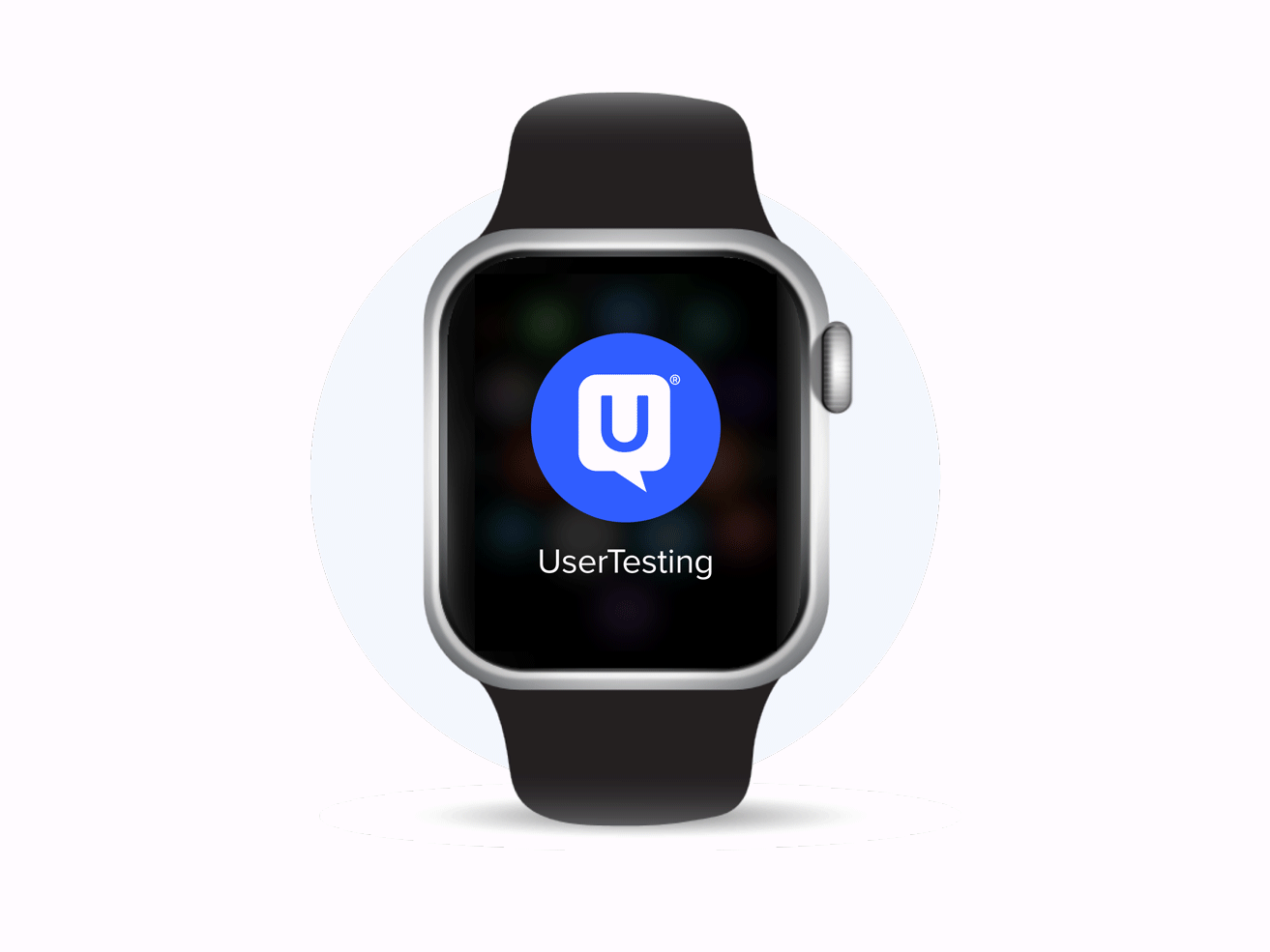
The refreshed system played out across the website, product, motion, and applications. A few representative artifacts — some I led, some I contributed to.
The refresh held — the system shipped, the icons stayed, and the homepage motion landed in production. A small thread of mine inside a larger weave.